 |
| Moving Picture World, 24-June-1922 |
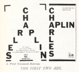
I like the design of these ads for Chaplin in "Pay Day." A large amount of white space was not common in 1922 ads.
Sayre Knows Just What
White Space Will Give
There are not many things you can tell J.W. Sayre, of the Jensen and Von Herberg
houses in Seattle. He has been through the mill ad while he is still learning, he knows
a lot, and some of his work is exceptional. One thing he learned long ago was the value
of white space and another was that you do not have to see certain stars on argument, but
through announcement. He knows that a large space is good, but that it does not have to be
filled with a lot of selling talk for Chaplin. He outlines his campaign on 'Pay Day' and
says:
"I am enclosing proofs of a series of four ads I got up here on Chaplin. He opened
Saturday and these ads ran Monday, Tuesday, Wednesday and Thursday, a regulation ad
going in on Friday.
"The ads must have had some effect as there was a long line before the Liberty box
office by 10:30 or Saturday morning and business almost shattered the house record on
Saturday and Sunday and has been exceptional ever since.
"The feature I aimed for in the ads were first, to build up in size steadily -- I believe in
a cumulative campaign reaching its crest about the day a picture opens and am
all through
with small teaser ads. Most of them are buried and lost, making them mighty expensive
as compared with a few sizable ads, say one a day, well placed. I drew top of column in
The Times with every one of these ads.
The second point I went after was to use few words and a lot of white space -- I always
did believe in white paper in an ad. Even in the four-column ad I used only a one-column
cut when plenty of four-column cuts were handy."
We do not agree with him on the teaser proposition. We believe that a good teaser
campaign is a capital thing for a small town. We believe it because we have seen so many
get over. As little as a two-inch space will get over even in a large town
if a sufficient
number of them are used. That is the nub of the argument. Teasers are good only when
there are enough of them to get over. Two or more on a page are needed in many towns and
small cities, where a single column, one inch, space in a small town may require only three.


